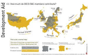
Mapping Worlds has produced a fascinating new map of the world showing countries in proportion to the amount of aid they give, and the amount they would give if they met the target of 0.7% of GDP.
Map of aid donors
Latest Posts
- Race report: Tallinn Ironman Middle Distance Triathlon (113km) – August 2025
- Why we need government digital identities and how to do it safely

- Are we ‘freeloading’ on US innovation?

- Age verification as digital public infrastructure

- Do not use text messages for 2-factor authentication if you can avoid it

3 responses to “Map of aid donors”
Cool. I’ve been looking for something like this… Thx. for posting!
Will check out your blogs too!
Owen,
Perhaps you can clarify. Does this particular map reflect foreign aid such as the cost of time, manpower, and material provided by the US as a result of natural disasters? The most recent of course would be the US military response to the tsunami in 12/04. The costs of such operations are staggering and should be included in “aid” numbers reported. Maybe not this particular chart but definitely in the “all aid” number which I am sure exists somewhere.
Best.
Owen replies: it looks to me as if this map shows aid as measured by the internationally agreed definition, known as Overseas Development Assistance (ODA).
Thx Owen